(877) 745-8772

Understanding Responsive Design

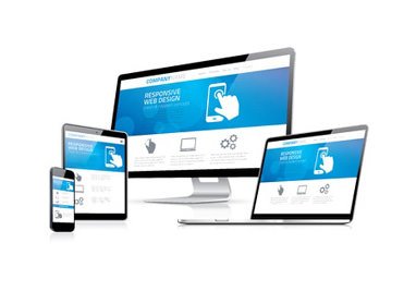
Responsive design is a recent trend that has to do with the optimization of websites for mobile and other devices. A unique web design approach in itself, responsive design aims to provide an optimized viewing experience to website users. This includes providing ease of reading and navigation across a wide range of platforms, including mobile phones, tablets, laptops, and PCs by minimizing the resizing, panning, and scrolling required on any given device. In other words, the site is able to modify or adapt to a particular device for the optimal user experience.

To learn more about what responsive design is and the benefits it offers, contact the web design experts at Silver Scope Design today.

How Responsive Design Works

Responsive Web Design

In responsive design,

  • Elements of the web page are sized relatively, using units like percentages rather than using absolute units like points or pixels.
  • Similarly, the flexible images are sized relatively. This ensures that the images do not flow out of the containing element or take up an overwhelming amount of space.
  • When loading the site, media queries consider the characteristics of the mobile device, tablet, or PC being used (like width of the web browser) in order to choose the ideal CSS style rules for that viewing format.

These features, in combination with components from the server side, result in websites that load faster and provide better usability and functionally across all types of devices.

Advantages of Responsive Design for Your Website

Before the responsive design approach, only single device solutions were used. These often had several pitfalls like slow loading times and limited features/functionality on mobile devices. With the new responsive design concept, businesses are able to engage their consumers effectively and easily across all mediums with one universal website.

The primary benefits of responsive design are as follows:

  1. Your website reaches mobile and tablet audiences:
    With more and more people turning to their mobile devices to browse the web, responsive design for your website can help you increase your audience reach, improve brand strength, and be a powerful aid to your Internet marketing efforts.
  2. Greater potential to increase your conversion rates and sales revenue:
    With responsive website design, you no longer need to redirect mobile users to a mobile specific website. Therefore, users who are familiar with your standard site recognize your consistent site. As a result, this familiarity, ease of use, and improved functionality create an overall positive customer experience. Customers are less likely to become frustrated with a lack of functionality or usability and will not leave your website to search for other alternatives. Therefore, your conversion rates also increase.
  3. Your website's visibility in organic search results increases:
    Google has begun to give preference to websites that adopt responsive design, seeing these as more user-friendly. Therefore, having one well-designed and search engine optimized responsive website can be a crucial online marketing tool for your business, helping you establish an effective Internet presence and attract new customers.
  4. Your website can be easily analyzed, reported, and monitored:
    Responsive design eliminates the need to track conversion paths, customer journeys, re-directions, and funnels between different sites for different devices. This allows you to use site analytic tools easily and all reports can be consolidated into one.
  5. You save time and money on website development and management:
    The biggest benefit of responsive design for your website is that you do not need to spend extra time and money creating an additional site specifically for mobile devices. Costs relating to the development, maintenance, and support of websites across several platforms also reduces. Additionally, development and management of content, site layout, etc. also become more economical since sites for all platforms are unified into one.

A Website with Responsive Design Can Add to Your Bottom Line

Responsive Design

Derived from the phrase 'responsive web design' coined by Ethan Marcotte in May 2010, responsive design was recognized by .net magazine as the second-best trend on the list of "top web design trends for 2012". Additionally, Internet search giant Google included responsive design in its webmaster guide in late 2012. Following suit, 2013 was named as the year of responsive design by Mashable.com.

Adopting responsive design for your website will help you create a better consumer experience on your website and also help it rank higher on Google's search results. With recent statistics depicting that mobile devices will soon out number laptops as the primary device people use for surfing the Internet, investing in responsive design will help you to stay ahead of the competition.

Contact Silver Scope Today to Learn More About Responsive Web Design

At Silver Scope Design, we are committed to staying up to date with the most recent advances in the website design industry. Therefore, we offer custom responsive design services as part of our complete range of website design services. Our team of expert web designers and copywriters will help you optimize your website for your target audience using responsive design. To learn more about the benefits of responsive design and how responsive website design works, contact us by phone or request a free web design quote online today.

Get Started:

If you want to see what our design team can do for you or want just want more information - call us at (877) 745-8772 or get a free website design quote online to take the first step towards an amazing new website.

Get Free Quote

or Call Us at (877) 745-8772